Mr. Grant’s Philosophy

How We Display: Hugh Grant’s six unusual methods for a unique museum experience

Kirkland Museum’s Founding Director & Curator Emeritus, Hugh Grant, was invited to give a PowerPoint presentation at Bard Graduate Center in Manhattan in March 2010 about how he developed and is still developing Kirkland Museum and its individual method of display. Grant has adopted six unusual methods which reinforce each other as a philosophical approach for a unique experience at Kirkland Museum. The illustrations below and examples given are from Kirkland Museum’s former location on Pearl Street, but the Bannock Street museum is still displayed in our signature salon style. Here is a description in Mr. Grant’s words, taken from his Bard lecture:

1. I display in a salon style, which can and, at the Kirkland, does mean two different things.

  • Fine art is shown in the same room with decorative art. For thousands of years, in castles, mansions and houses, people have placed decorative art together with fine art. Therefore it seems natural to display like this. Large city museums mostly separate them, allowing them to hang posters or graphics on the wall with scenes of historic room installations, photos of the artists, etc. So, in most museums, if you see furniture in a room, you do not see paintings on the wall, and vice versa. Exceptions are The Barnes Foundation near Philadelphia—which has gone through the tremendous fight over moving downtown; and The Isabella Stewart Gardner Museum in Boston—but, of course, those were private houses at one time. Another exception is here in New York—the Neue Galerie. I hadn’t seen the Barnes, the Gardner or the Neue Galerie until I opened the Kirkland in 2003. But it is comforting for me to find I have company in doing this salon atmosphere.
  • Salon style can also mean that paintings and other art are displayed very close together. Although I have only double hung paintings so far, the paintings at the Gardner are triple hung and at the Barnes they are quadruple hung. We have a precedent: Vance Kirkland used to say, “I like to see what I’ve got.” So instead of stashing many paintings and objects in his basement he hung his house and studio salon style. [For a local example of salon style with paintings hung very close to one another from the floor levels, see the American Museum of Western Art – The Anschutz Collection.]

2. I display objects in a study collection manner, where more objects are displayed per square foot. That way many of the lines can be seen with a variety of colors, shapes and patterns. For instance, here’s an entire case of Teco ceramics (below).

I decided to show all eleven colors of American Modern (left), designed in 1939 by Russel Wright, including the rare Steubenville Blue, and here is the only pitcher in that color known to be on public view. Because those pieces are fired at low temperature as earthenware, their colors are radiant.

And one can only realize the magic of Eva Zeisel’s 1942 Museum line of tableware (left) by showing many of the shapes together, as they curve and interact with each other and relate as a harmonious whole.

The Art Deco period line of Catalonia (above) which anticipates modern, designed by Reuben Haley in 1927, is even more extraordinary when a number of the seemingly melting shapes and unusual colors can play off each other. Most large city museums have adopted the sparse mode of display, which often highlights a few spectacular examples of art works with dramatic space around them. But, again, I wanted to give visitors a unique comparative experience at the Kirkland and chose to be different.

3. I often do vignettes, with a coffee table in front of a sofa, side tables on each side of the sofa, two chairs flanking the table and objects on the tables such as sculpture, a period lamp, a period phone, a period radio, a period clock, etc.

Visitors love this atmosphere; it feels like a house, even though no part of the museum or studio was ever a home. The designer of the settee and coffee table shown above in the photograph at right is Michael McCoy. He was the co-director, with his wife, Katherine, of the Cranbrook Academy design department for 24 years.

4. I do comparative display: for instance, in the first large room at the Pearl Street location, I displayed both Modern and Art Deco, because Modern comes out of Deco, and college classes can make comparisons in the same room. The teachers and the students find this very helpful. [At the current museum location on Bannock Street, Promenade Gallery 2 allows for this comparison.]

Kirkland Bard 8
Art Deco
Kirkland Bard 9
Modern

5. Most museums display furniture on risers, but furniture was never meant to be seen on risers. Visitors to the Kirkland are very excited to see how iconic, historic furniture looks when displayed on the floor where it is supposed to be. They can immediately relate to the scale of things that way, relative to them and relative to other things.

6a. Labeling represents a major difference between me and many other museums.

I normally put small and medium-size labels by each piece, as seen here (and these objects are generally in glass cases).

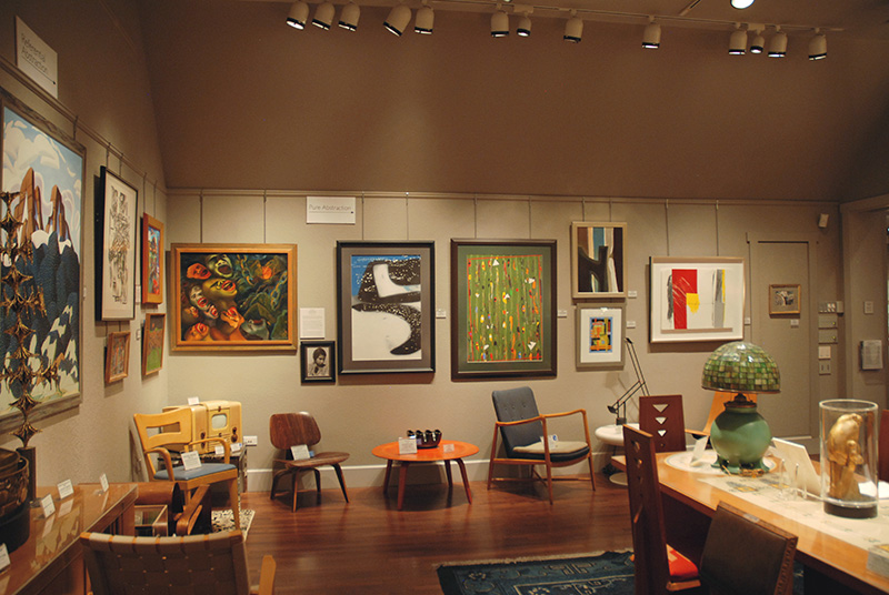
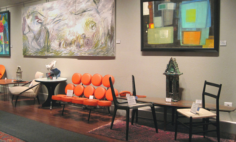
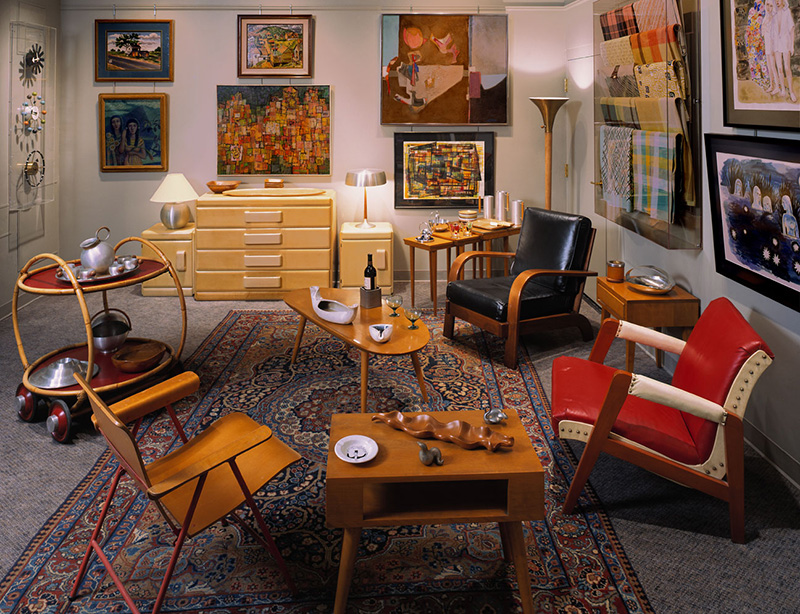
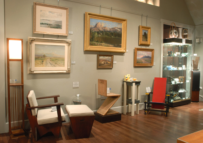
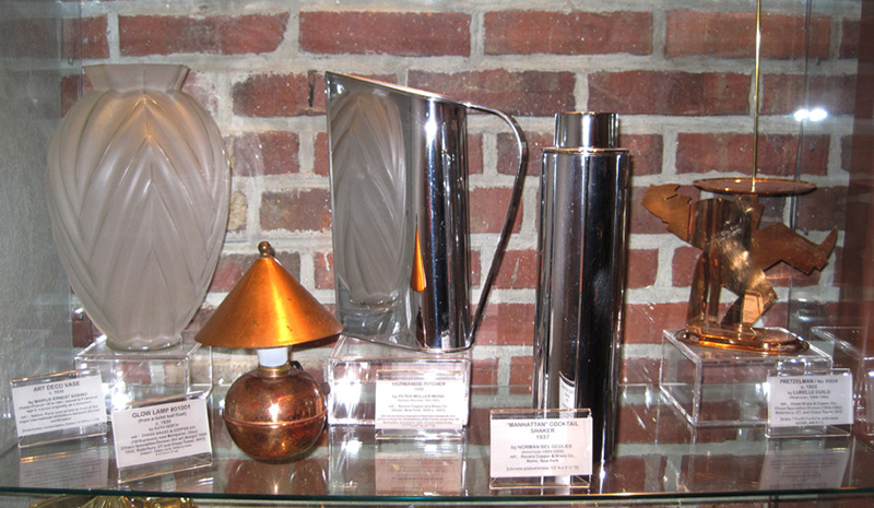
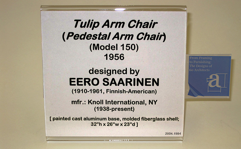
Larger labels are put on furniture. This differs from most museums, which have small markers with numbers next to the pieces, as at the Neue Galerie in New York City. At many museums, object information, keyed to the numbers, can then be found either on coated pages somewhere in a wall pocket nearby or listed en masse on the front of cases, on panels. This requires a lot of work on the part of the viewer to match them up and instead I want to make it as easy as possible for visitors to know what each art work is, if they want to know. At other museums I have seen people shrug and walk away from an object or case without going to the trouble of searching for the tag information because it isn’t immediately accessible. I put the information tags next to the objects and on each piece of furniture (so I guess you could say, there’s no deferred gratification at the Kirkland). But, of course, this makes my cases even busier than they were before the information tags—nevertheless, visitors seem to universally appreciate our regard for facilitating an enjoyable museum experience.

6b. More on labels:

Because objects are displayed in a study collection manner at the Kirkland—where more objects are displayed closer together in a given space—instead of listing the artist’s name first, I put the object name first—for instance on this Art Deco shelf are (l-r) Glass Vase by Marius Sabino, Glow Lamp (which is actually a toilet ball float lamp—you see the brass thing) by Ruth Gerth for the Chase Co., Normandie Pitcher by Peter Müller-Munk, Manhattan Cocktail Pitcher by Norman Bel Geddes and Pretzel Man by the Chase Company. This way visitors can easily locate the tag of the object if they want to know more about it. Also, I put quite a bit of information on a tag. The viewers can decide whether they want to read all of it, or they can only read the date and artist’s name if that is what they want to know or are in a hurry. To compensate for not listing the artist’s name first, I list the artist’s name in large, bold, capital letters on the tag.

6b. More on labels:

I realized that there is an additional angle from which to view the Kirkland decorative art collection, which would help many classes and groups who come in. The work of dozens of architects are on view at any one time because of the number of objects we have—such as Charles Rennie Mackintosh, Frank Lloyd Wright, Joseph Hoffmann, Alvar Aalto, etc. So I have inserted into the tag of those objects a small graphic of a wrinkled blueprint with an “A” on it for architect. Many architectural schools inside and outside Colorado, including thirteen students from Harvard, have come specifically to view objects by architects at the Kirkland.